

infokiosk to lakioo rebrand
Project focus:
Brand Design
Motion Design
Marketing
Tools used:
Illustrator
After Effects
1
context
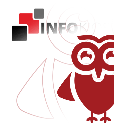
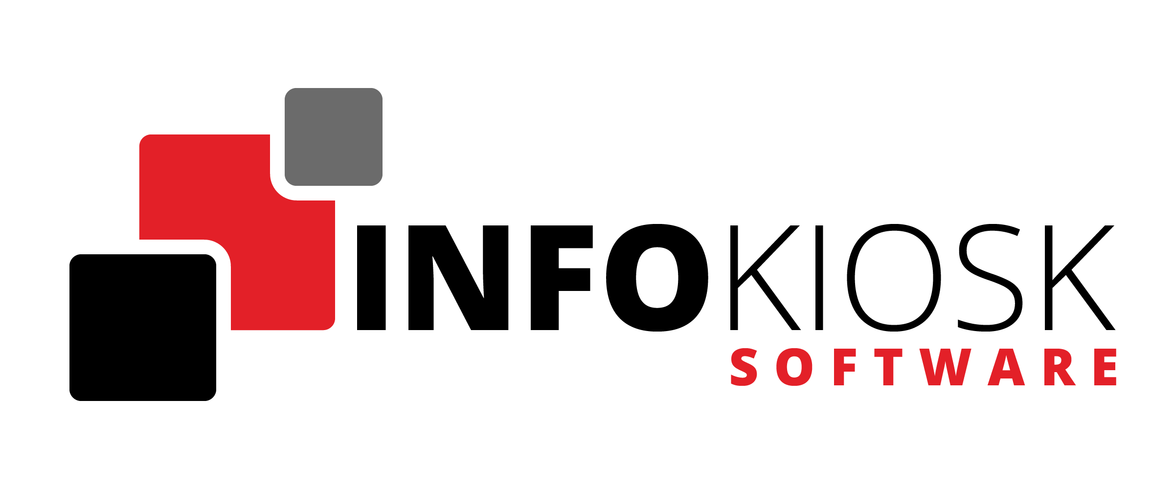
INFOKIOSK Software Suite was from the start made to be approachable and modern digital signage CMS, however the original brand identity didnt reflect that. Which created an opportunity to rethink the brand and its identity from the ground up.
2
challenge
The new identity needed to differentiate LAKIOO from traditional digital signage CMS platforms while communicating that the product is intuitive, approachable and designed to help users work smarter.
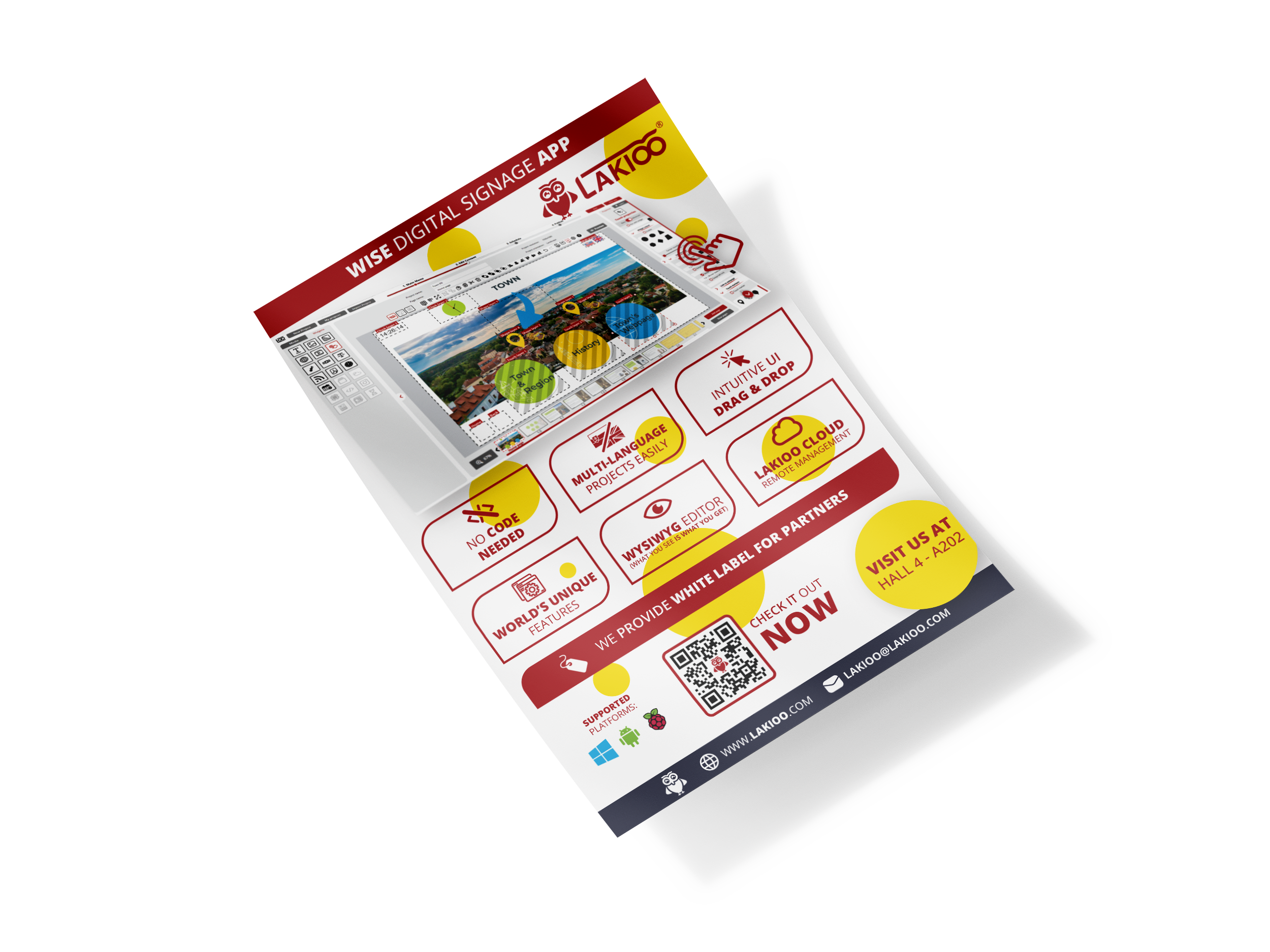
WISE Digital Signage App
3
solution
Together with three colleagues, we developed the LAKIOO name and the concept for its wise owl mascot. I then designed the new logo, developed the owl character and created the new animated intro. The identity uses the owl as a symbol of wisdom, guidance and thinking ahead, reflecting LAKIOO Creator’s ease of use and intelligent approach to digital signage.
Advantages of changing visual identity from INFOKIOSK to LAKIOO
LAKIOO – Unique and short name, able to be registered as a trademark in Europe and America
Wise Owl – recognizable mascot, a rare sight in digital signage market
Yellow, White & Burgundy – vibrant color palette that stands out
Floating Circles – dynamic & recognizeable accent piece, that completes the visual identity
usage
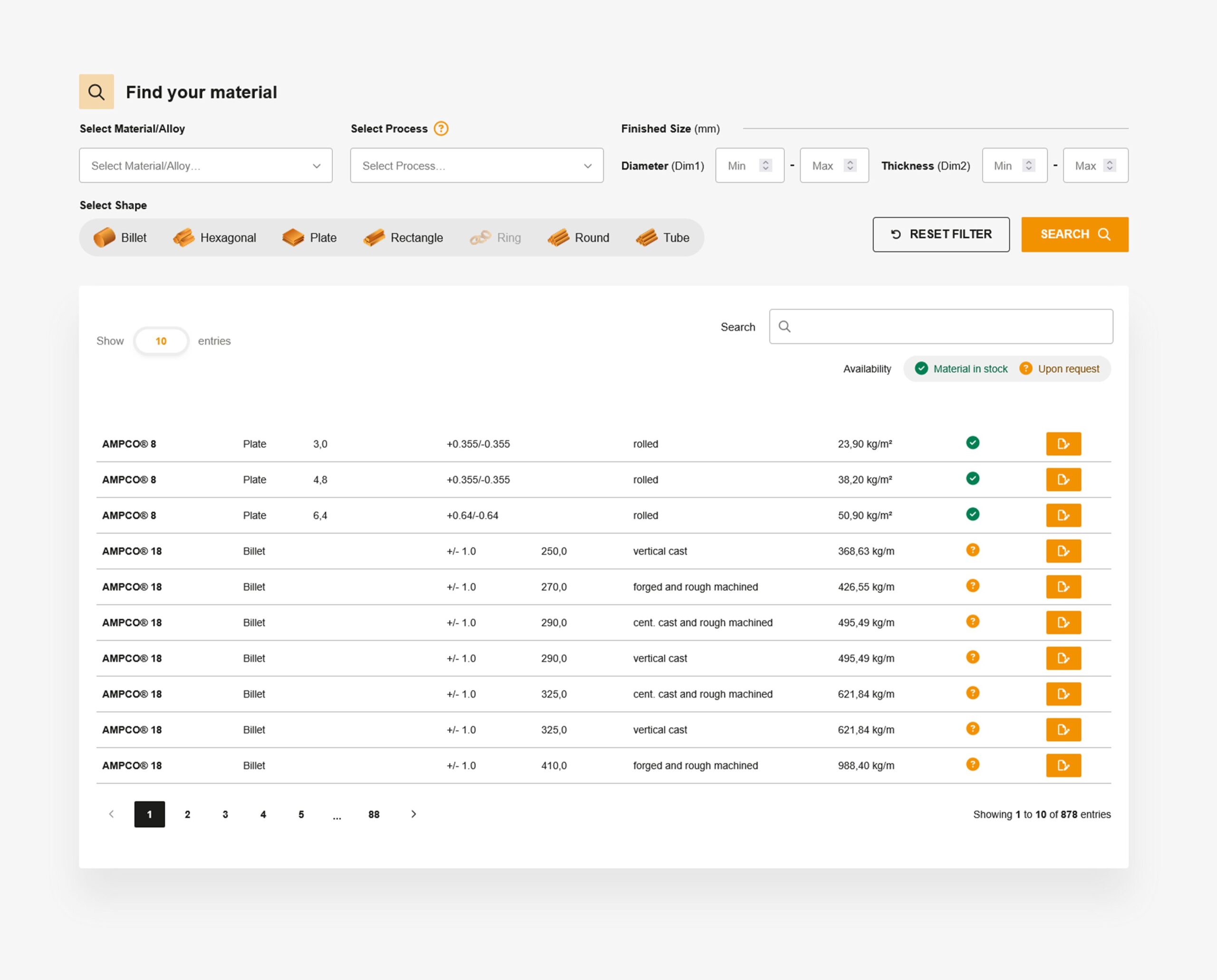
These illustrations are used throughout the website, displayed in places such as Product Selection Tool, Material Stock Availability or Alloy Description.
dodavka, pero, vizitka