project's key points
rebrand
A complete rebrand from Infokiosk to LAKIOO. New, friendly, wise and vibrant visual identity that stands out between the competition.
intuitive ui
Key point of LAKIOO App is, that it is very easy and intuitive to use, so naturally, it was a key point when I designed the UI.
smart features
The app has many smart features that guide and help the user with the creation of their Digital Signage or Interactive projects.
how it began
At the start of 2024, we at InfoKiosk decided, that we need a new visual identity. An identity that’s harmonious with the vision and purpose of our app. Since the app was meant to be our main product, we opted to do a complete rebrand, instead of only promoting the app itself.
the rebrand
After multiple brainstorming sessions, we made the decision to rebrand to LAKIOO, there were multiple strong reasons behind this rebrand.
- The need to register a worldwide trademark, to enter into international markets
- Brand mascot that makes the brand instantly recognisable
- New and vibrant colour pallette that's different from competitors
With these guidelines established, I got to work designing the new visual identity of LAKIOO…
at lakioo i was in charge of
- Designing the software's UI and UX
- Shaping initial ideas into polished features, that help the end-user
- Creating tasks for programmers, bug-testing and returning with feedback
- Designing the LAKIOO.COM website, shooting and editing the promo video, and much more
- Visual rebranding from INFOKIOSK to LAKIOO, for worldwide markets
new brand identity
I designed the new visual identity in accordance to the guidelines we set earlier, there have been many iterations, until we settled on one, that we felt like best represents and compliments our flagship product – LAKIOO App Suite.
The Digital Signage market is full of bland colors and cookie-cutter logos, that are very similar to one another. Therefore none of them stand out, this is why we decided to go in a completely different direction.
This new visual identity met and exceeded the requirements we had:
- LAKIOO - unique & short name, able to be registered as trademark in Europe and America
- Wise Owl - recognizable mascot, a rare sight in digital signage market
- Yellow, White & Burgundy - vibrant color pallette that stands out
- Floating Circles - dynamic & recognizeable accent piece, that completes the visual identity
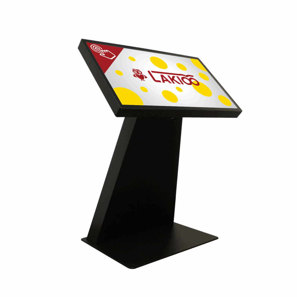
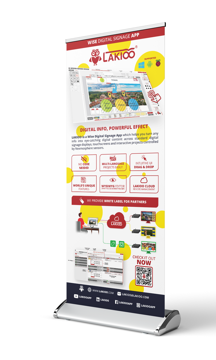
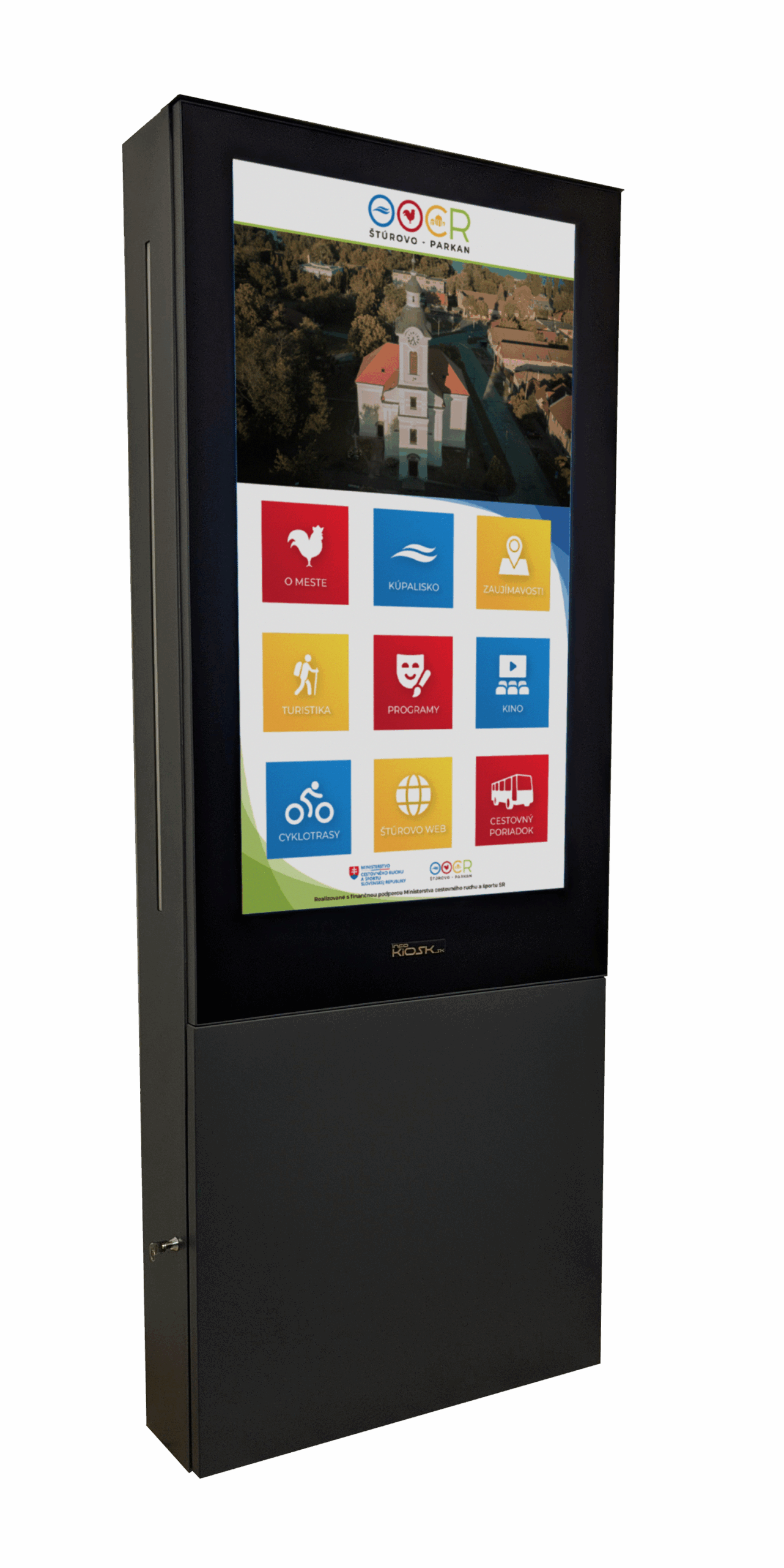
what is lakioo app?
Well, it’s many things joined into one concise, streamlined & user friendly software suite, primarily used for content creation and management of digital signage screens. Watch our Promo video where marketing director Evka explains, what is LAKIOO.

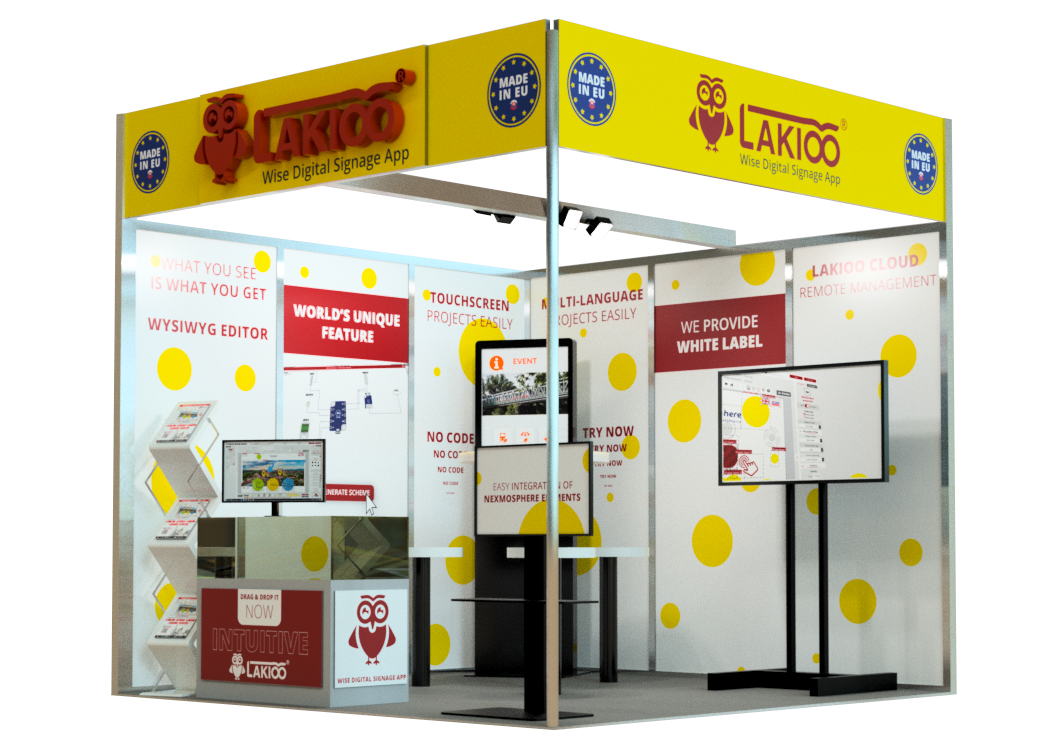
Or watch this video, we played it at ISE 2025 to promote our Unique Selling Points to potential customers.
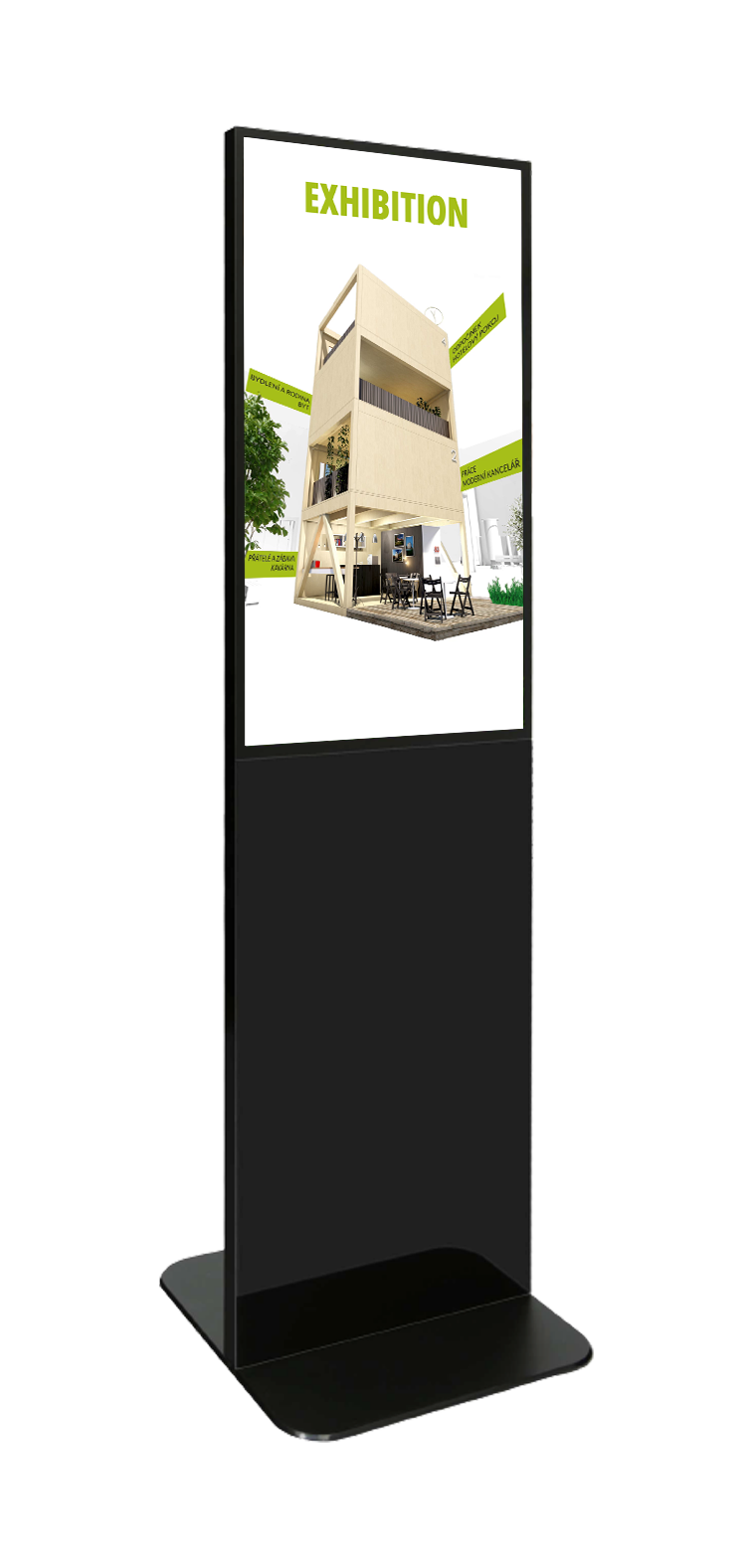
Staying on topic of ISE 2025, I made this 3D visualisation in Fusion360 to help us interactively plan out our stand
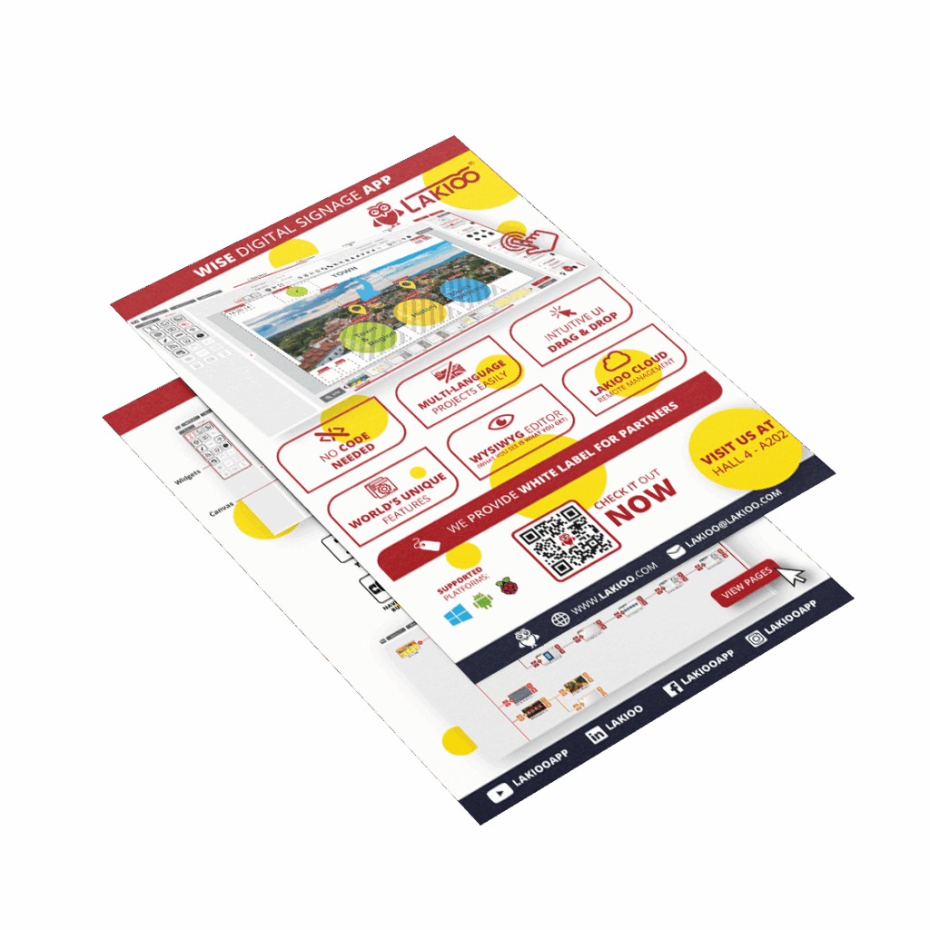
the ui design of lakioo creator
From the start we knew that, unlike other solutions for creation and management of digital signage, LAKIOO has to be designed with the user in mind, it might seem obvious, but in reality, it is so rare that we couldn’t find one good example to inspire ourselves and build on. They mostly use outdated and nonintuitive UI/UX, that looks like it was designed in the last millenium and working within them is far from intuitive.
So instead, we looked at modern apps used for graphics creation, that rely on large canvas, which makes it easy for user to see, what he is creating. Many digital signage CMS don’t actually let the user see right away, what he or she created, without first opening the preview. That is something we fundamentally couldn’t agree with and we based our app on WYSIWYG (What You See Is What You Get)


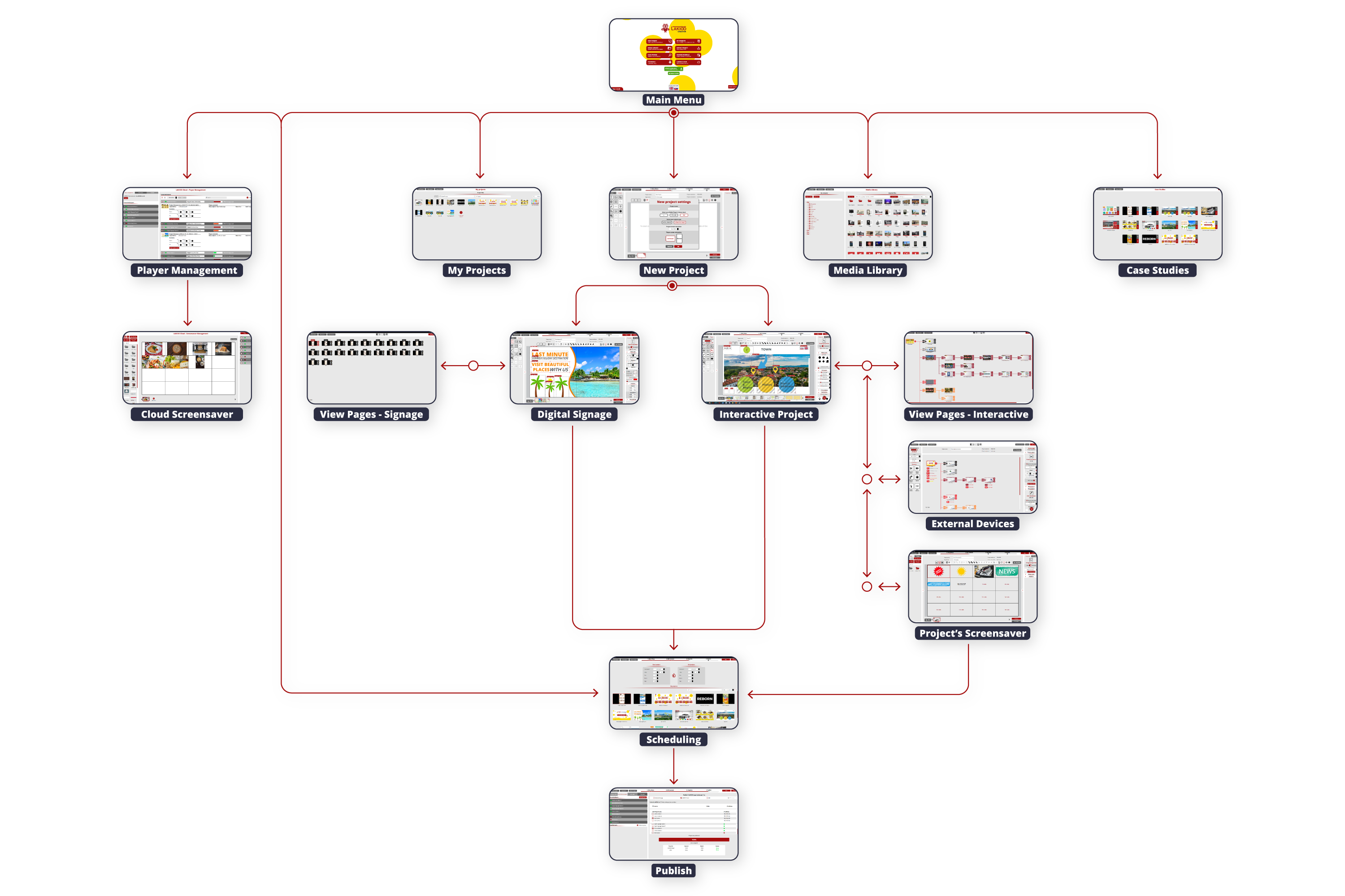
lakioo creator flowchart
If you want to learn more about LAKIOO or even try out the Free Demo, feel free to visit our website
Or take a look at my other projects and navigate back to the Home Page